About
Kartel is a Mexican restaurant in Chorzów. Despite its delicious and popular food, the website is of poor quality. This may deter potential customers and negatively impact profits. In the competitive restaurant market, the website should entice users to try the food while browsing. Let's make significant improvements to enhance the website's effectiveness for business.
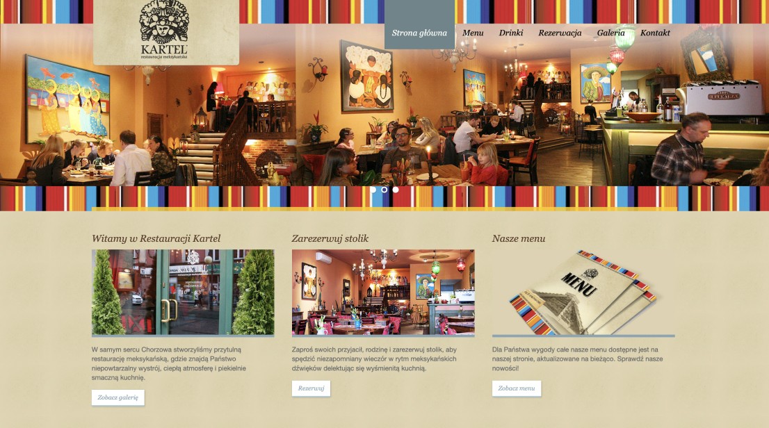
Main page before redesign
The problem of information architecture
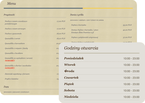
One of the most significant issues with this website is its poor information architecture. There are too many subpages, and much of the information is overly detailed and includes unnecessary elements. For instance, the opening hours are described in seven lines, which could be condensed into one. Additionally, the food menu is excessively long, spanning multiple screen heights on a large desktop and appearing even worse on mobile devices. This is crucial information that needs to be presented more effectively.
Failed details
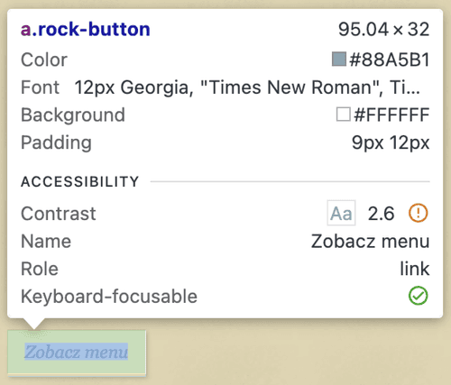
Unfortunately, even the smaller details are flawed. Low contrasts, outdated elements, square and inconsistent buttons without focus states... These minor issues contribute to a subpar user experience for a restaurant as esteemed as Kartel. However, with targeted improvements, these deficiencies can be addressed, elevating the website to a level that will boost business.

No responsiveness
The mobile versions of this website are even more problematic than the desktop versions. They require significant layout changes and additional responsive breakpoints to accommodate all device types.
Main page redesign
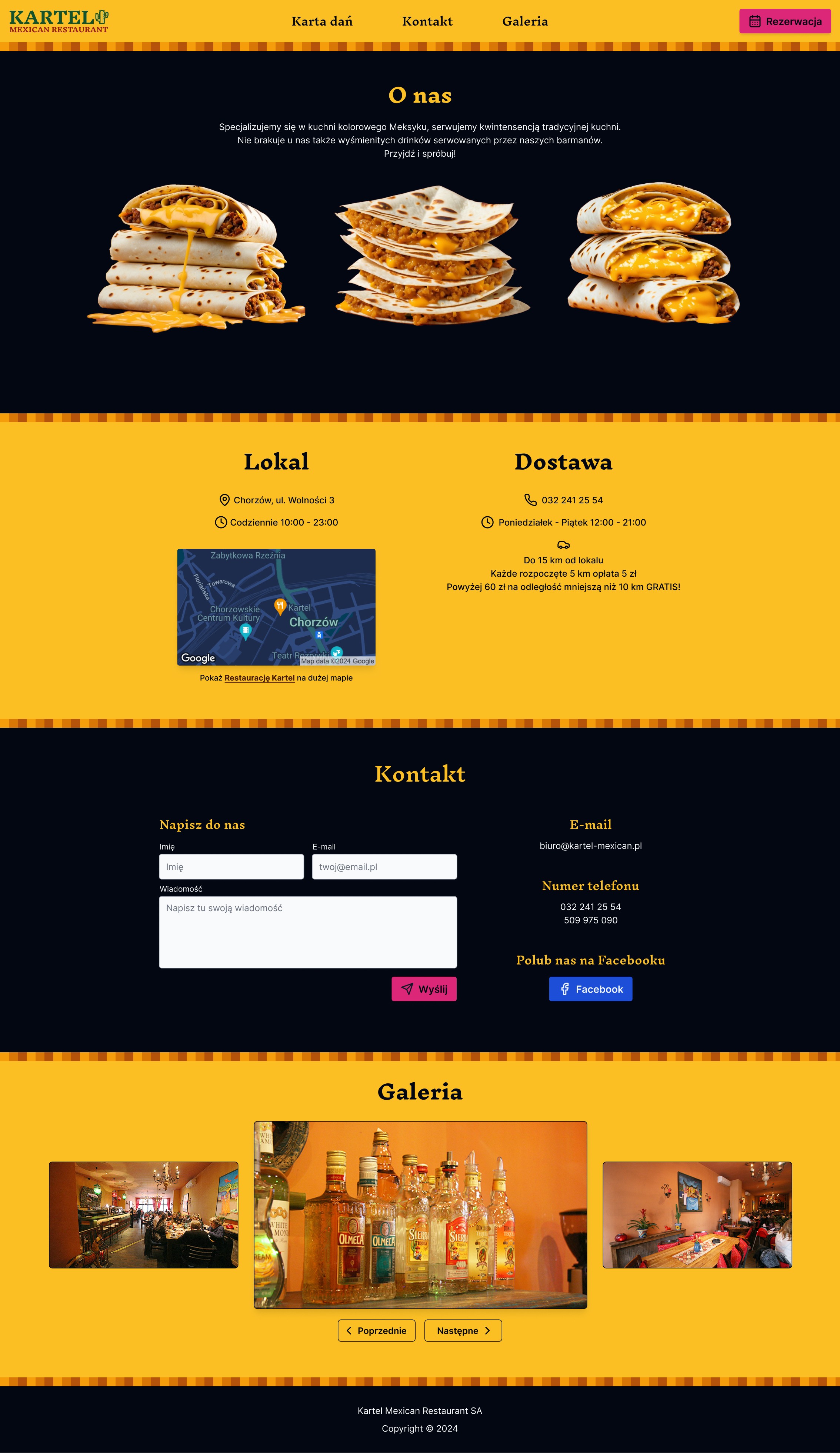

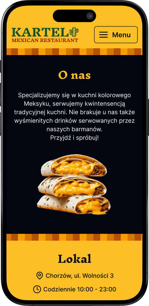

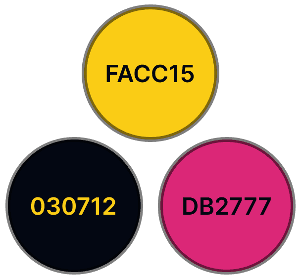
First of all – colors
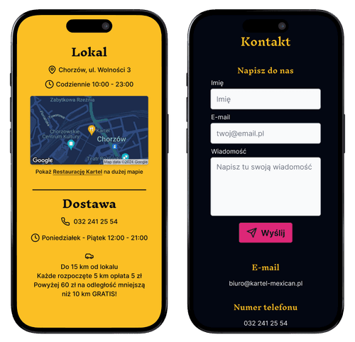
On restaurant websites, colors play a crucial role. The ketchup and mustard theory suggests that red and yellow are colors that can stimulate appetite. These warm and vibrant hues are commonly used by popular fast-food restaurants in their branding. I chose yellow as the primary color for this website, as it complements the abundance of cheese in the restaurant's dishes. A dark background color provides a contrasting backdrop, while an eye-catching pink accent is used for the CTA buttons.
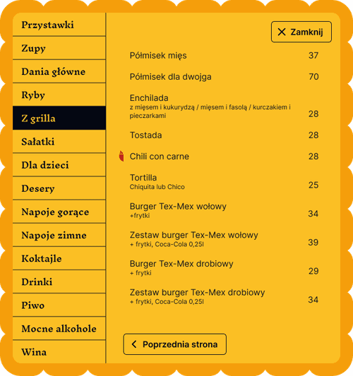
Interactive and intuitive elements
Designing elements that resemble real-world objects can enhance intuitiveness. For example, the food menu now resembles an actual restaurant menu, making it more readable and organized by categories. Additional markers have been added to indicate spicy and vegan dishes.
Clearer navigation
Designing elements that resemble real-world objects can enhance intuitiveness. For example, the food menu now resembles an actual restaurant menu, making it more readable and organized by categories. Additional markers have been added to indicate spicy and vegan dishes.
Click the button below and try it yourself
2026 © Designed and developed by Filip Grzesik
